--.--.--
Case File — Accessed
VUDU To Go
Record 03 / 04
Justin Lee — VUDU To Go · 2018
Record Open
--:--:-- Local
Case 03 / 04
Case Study

VUDU
To Go

Role
UX Architect
Scope
Online Consumer Feature
Timeline
Jan 2018 – June 2018

VUDU To Go — final design
Vudu To Go

Vudu is a VOD Streaming service company, that originated from selling physical copies of movies. With the company moving its strategy to selling digital copies, users were left with an outdated system to download and watch content offline. Vudu To Go was the feature designed to bring this process to the new generation.
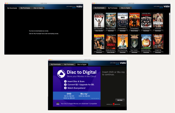
Through user testing, there were some insights the researchers found that was most important in designing the product:

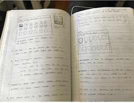
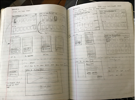
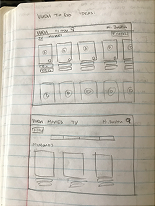
I start by brainstorming solutions quickly through sketching. The original experience listed titles in the order DVDs were inserted, which became a real problem for users owning hundreds of titles, as cover art alone wasn't enough to identify what they wanted. There was also no space for descriptions, making it especially difficult to find the right episode in a TV series.

My initial approach was a hover state to surface details on the title cards, but I ultimately moved in a different direction.

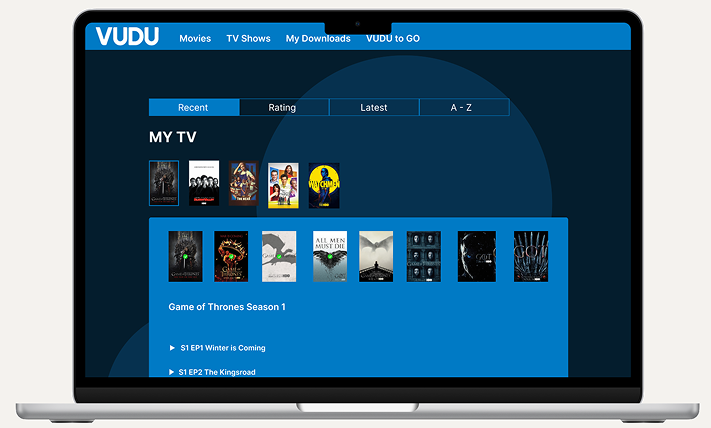
For the final designs, I focused on solving the information navigation issue. Through iteration, the best solution was an accordion-style list, keeping the experience scalable while surfacing movie and TV show details clearly.

A filter at the top lets users quickly sort their library by what they want to watch or download. I also rebranded the Disc to Digital feature, updating it to reflect the new CD key conversion method.

This solution works because it's built for the right audience: users who already own the content, not people browsing to buy.

My contract ended as the feature was handed off to development, so I don't have data to validate the build. That said, the experience taught me a few things: the solution has to serve the right user need. Hover states felt clever but missed the point entirely. Scalability matters too. Individual pages per title weren't sustainable, while the accordion pattern allowed for a templated, repeatable design.

I also got my first real exposure to working within a structured design org, collaborating across dedicated UI, UXR, and UX Architecture teams.